Stop Losing Clicks—Build Pages That Convert
An article we liked from Thought Leader Ruben Dominguez of The VC Corner:
Win the First 5 Seconds: The YC Landing Page Formula for Early-Stage Startups
A practical field guide for first-time founders + 180 YC Landing Pages That Helped Raise $400M+

YC-style pages win by promise, speed, and de-risking
Before anyone signs up, books a demo, or even tries your product, they make a subconscious decision in five seconds: Is this for me, or not?
That’s the exact moment that decides whether your traffic converts or vanishes.
Great startup landing pages don’t just look clean or clever, they do three things fast: make the right promise, remove friction to the first “aha,” and de-risk the decision to engage.
Forget aesthetics. This is a conversion system. And YC founders are expected to master it before they launch anything.
Here’s a cold hard truth. Across 57 million conversions and 41,000 pages, the median landing page conversion rate is just 6.6% [source: Unbounce]. Top-performing startups often exceed 10–15%. Most early-stage pages underperform badly.
This guide gives you the blueprint to beat that. You'll walk away with a tested page structure, a 10-point checklist, and conversion tactics you can ship this week; all grounded in what YC expects from founders and what real users respond to.
Let’s build a page that earns the click.
1. What YC Actually Recommends (And Why The Data Agrees)
YC doesn’t give design advice to make things pretty. Their focus is one thing: conversion. Here’s how they expect founders to build landing pages that actually work, backed by startup results and hard data.
One Page. One Job.
Every landing page should lead to one clear action. Not a navigation menu of choices. Not five buttons. Just one thing you want the user to do. That’s it.
Pete Koomen (Optimizely co-founder, YC alum) calls it the 1:1 attention ratio; one core message, one call-to-action (CTA). This keeps the user focused and reduces friction. If your primary CTA isn’t obvious in two seconds, you’ve already lost the click.

Clarity Beats Motion
Drop auto-sliding carousels, gifs, videos. YC’s teardown team calls these “conversion leaks”, because they bury your best pitch behind animation that users don’t wait to see.
Instead, you should front-load your strongest benefit statically. If you have multiple points, use a clean layout or tabs. Let the user scan. Don’t make them chase value.
Simple Words. Faster “Aha.”
If your copy reads like a pitch deck or policy doc, it’s too complex. YC’s internal advice is simple: “Would your mom understand this headline?” If not, rewrite it.
And this is backed by data. According to Unbounce’s report, high-grade-level writing with difficult words converts almost 25% less than simpler copies.

Simply put, you are not building thought leadership through your landing page. You are converting visitors who already heard about you. Use shorter words, direct verbs, no fluff.
Rule of thumb: If your headline wouldn’t make sense to a smart 12-year-old, fix it.
2. The Hero Section: How To Win The First 5 Seconds
When a visitor lands, they make a snap judgment: Is this for me? You have one screen to answer yes. That’s the job of your hero section. Nothing else matters if this part fails.
A high-converting hero delivers clarity, action, and proof; without fluff or friction. Here’s how.
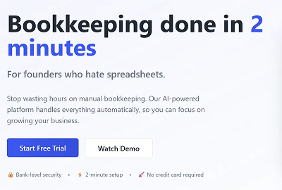
Use the Outcome-ICP-Pain Formula
Your headline should speak directly to the user and what they get. This is not about what you built.
Formula: Outcome for [ideal customer] without [common pain]
That’s sharp positioning.
Examples:
“Bookkeeping done in 2 minutes, for founders who hate spreadsheets.”
“Ship new features faster, without waiting on your backend team.”
“Verify user IDs in seconds; no manual review, no compliance drama.”
Avoid headlines like “The Future of Finance” or “We Power the World’s Teams.” Nobody knows what that means. Be literal, be useful, and be fast.
Rule of thumb: If your hero copy requires a second scroll or a demo to be understood, it’s failing.
Lock In One Primary CTA
Your hero section exists to drive one clear action. “Try free.” “Get a demo.” “Start now.”
One primary CTA. Not three buttons. Not a split path. One.
If you’re targeting developers, a secondary CTA like “View Docs” or “Run CLI” can sit nearby, but never compete for visual attention.
Test question: If someone screenshots your hero, can they tell what you want them to do?
Show the Result, Not the Interface
A static dashboard screenshot isn’t enough. Users want to see the outcome before they commit.
The best YC landing pages embed a 10–60s loop or interactive clickthrough that shows the magic fast. Think: a mini chat, a data transformation preview, or a short screen-recorded result.
Why it works:
Attention spans drop sharply after 45s. Shorter loops win. (Backed by science)
Demos that show outcomes (“report generated,” “customer matched”) trigger desire faster than ones that show features.
Motion, when meaningful, outperforms static UI.
If you must use video, place it directly below or beside the CTA, overlay a clear play button, and include a caption: “Watch how it works in 45 seconds.”
Callout: Five Checks for Your Hero
Make sure your hero passes these five conversion tests:
Reading grade ≤ 8th – short, simple words your mom would understand.
One CTA – clear action, no clutter.
Outcome-first copy – what the user gets, not what you built.
Visual proof nearby – micro-demo, animation, or a short result video.
Loads under 2s – compress assets; don’t lose users to lag.
3. Tell The Scar-Tissue Story: Problem → Agitation → Transformation
Most startup sites just throw features at the user. The best ones show a before-and-after they can feel.
This is where your page earns trust. A strong problem narrative tells users: we’ve been in the mess you’re in, and we built our way out.
Here’s how to structure it so it converts:
Before: Show the Pain That Stalls Progress
Start with the real status quo, the part of the workflow that’s slow, expensive, or soul-sucking. This isn’t about surface-level frustrations. Go deeper.
Before: Support teams were buried in basic account reset requests.
Cost: Engineering was spending 12 hours a week helping users get unstuck.
Don’t make this generic. Use the exact phrasing customers use on support calls and demo objections. If someone said “we’re drowning in tickets that aren’t even bugs,” build off that and don’t just summarize it.
Agitate: Highlight the Hidden Cost
Once you’ve named the problem, press on it, but gently. Your goal isn’t fear, it’s urgency.
Agitate: The backlog delayed feature rollouts, hurt onboarding scores, and left high-LTV users frustrated.
Skip clichés like “chaotic” or “messy.” You need to show the real business impact. Great landing pages don’t just say “this sucks.” Potential customers know that. Great landing pages say “here’s what this bottleneck is really costing you.”
After: Prove the Transformation (with Numbers If You Have Them)
Now give them the “after” state: what changed, and how it made life better. One line of impact, followed by how the product delivered it.
After: Onboarding time dropped by 60%, and 92% of resets now resolve automatically.
How: We added a self-serve workflow triggered directly from the error state; no support tickets required.
Quantify only if you’ve got real numbers. Otherwise, keep it qualitative, but specific.
Rule of thumb: If your “after” doesn’t feel better than the status quo, rewrite it.
4. Pricing On The Landing Page: Clarity First, Psychology Second
Nothing raises bounce rates faster than confusing or evasive pricing. Your landing page isn’t just a sales tool, but a trust contract. And nowhere is that more visible than how you handle cost.
This section is all about designing a pricing experience that makes the right users say “yes,” without regret, confusion, or second-guessing.
Build a Table That Tells the Truth
Start with a three-tier layout. It works because it gives users context, comparison, and control. Structure each plan around your real ICPs, not vague labels like “Starter” or “Premium.”
What works:
Clear feature fences: usage caps, SLA access, SSO, integrations.
Honest math: don’t hide monthly-vs-annual toggles, or fudge savings percentages.
Transparent plan logic: if the middle tier is the best fit for most, make sure the benefits are framed that way, visibly, not just with a badge.

Avoid dark UX tricks. No buried costs. No hidden fees. No checkout surprises.
Pro tip: If your own team can’t explain who each plan is for in one sentence, neither can your customers.
Use the Decoy Effect, Ethically
One psychological tool worth testing: the decoy effect. By adding a clearly inferior third option, you make your target plan feel like the obvious choice.
This effect, first studied by Huber, Payne, and Puto (1982) and later popularized by Dan Ariely, hinges on asymmetric dominance. If Plan B is better than Plan A in every way, but only slightly more expensive, it draws users away from Plan A and toward your real goal: Plan B.
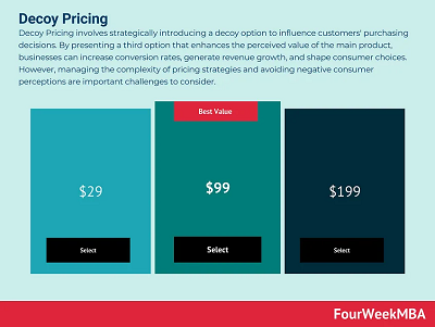
But here’s the guardrail: only use “Most Popular” badges if the data backs it up. If 70% of your users pick that plan, go ahead and show it. But if not, skip the badge. Don’t gaslight your customers into a fake preference. That’s manipulation territory.
Price Is a Friction Point, So Reduce the Risk
Don’t just show prices. Show what happens if the user isn’t ready.
Right near your primary CTA, place a risk reducer:
“14-day free trial, no credit card required.”
“Cancel anytime.”
“100% refund in the first 30 days.”
Make this adjacent to the decision, not buried in the footer or FAQ. When someone’s finger is hovering over “Start Now,” the thing stopping them isn’t a feature question, it’s fear. Address it right there.
Freemium vs. Free Trial: Tie It to Activation
If you’re deciding between freemium and free trial, let data guide you. Freemium works when users reach value before they hit a paywall. Free trials work better when value is clear but delayed, and the upsell path is short.
If you’re seeing too many free users stuck at “tire-kicker” level, move to a time-limited trial with guided onboarding. Let users taste the magic, then ask for the upgrade. And don’t be afraid to…
Read the rest of this article at thevccorner.com...
Thanks for this article excerpt and its graphics to Ruben Dominguez of The VC Corner.
Image by engin akyurt on Unsplash
Want to share your advice for startup entrepreneurs? Submit a Guest Post here.